
Portland Nightlights...
- Benjamin Taggart
- Sep 1, 2025
- 7 min read
Updated: Sep 8, 2025
For some, the front door is just a place to receive snail mail and packages. But for some others, the front door, porch, and even the entire yard comprise a blank canvas waiting to be filled with color.
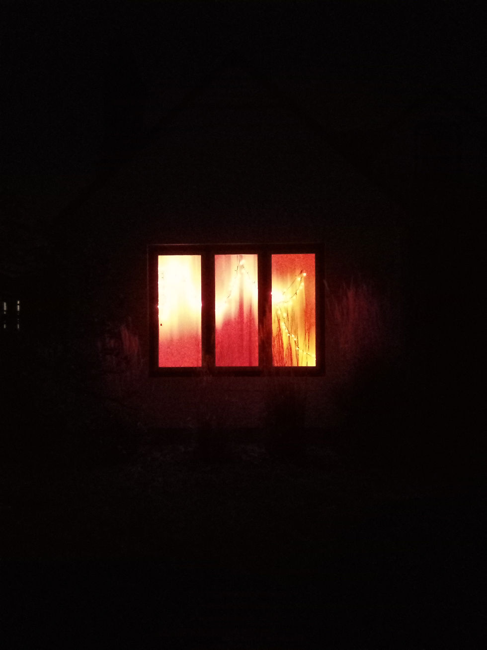
Light and color are especially important to me, though, ironically, the light above my front door is always off. But the picture below shows the notes around my desk, illuminated by red, green, and violet lights...

The lights and notes are always alternating, because I take a lot of notes and like using different colored lights to help put me into an alternative state of mind. The notes below were taken on one such occasion...

For the benefit of those who can't read my handwriting, the first part of these notes is best translated as, "Take pictures (at night) of lights on people's porches... on the way to The Plaid."
The Plaid is short for The Plaid Pantry. That's the name of a chain of mini marts where I live in Portland, Oregon. I've been on a reverse sleeping schedule for a while now, i.e., asleep during the day and awake at night, but since The Plaid is open 24/7, that's where I've been riding my bike to for beer and burritos. One night, I started noticing these lights, mounted in the trees outside someone's house along the way...

I'm usually so focused on whatever it is that I'm doing that nothing else matters. So I must've passed these lights a hundred times before realizing that they were something special. But the second part of the aforementioned note reads, "I'm not alone in my appreciation of weird light."
If you've read any of my sorcerer blog or select entries in my DeviantArt journal, then you're already aware of my interest in light, color, and rainbows...

You also know that although I love rainbows, my obsession with them has nothing to do with the rainbow's most popular, contemporary association. Still, that doesn't mean I can't stop once in a while to admire the lights on someone's porch, knowing that that association is crucial to them...

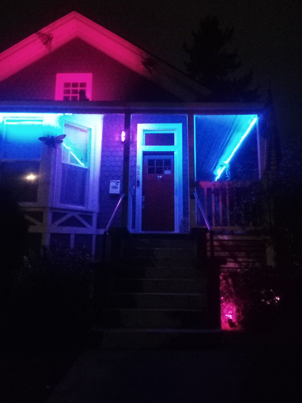
In fact, rainbow-colored lights are the most mesmerizing, especially when they're animated, and I often stop just to watch the colors change...

I take a lot of pictures of houses with rainbow-colored lights...

And this is one of my favorites...

The lights on this porch were only barely visible from the street. So getting the picture meant sneaking between two tall, light-blocking plants and practically walking right up to the house's front door. But it was worth it for several reasons, the most symbolic of which being that, at this distance, the bars on the windows clearly indicate that the house's occupant is an introvert. Which begs the question: why would an introvert choose to express themself creatively with the medium of light, i.e., something that stands out so clearly in what would otherwise be anonymizing darkness?
I don't have an answer. But if the occupant in the house pictured above chose to put colored lights into something so grand as a "golden" chandelier, then light and color must be important to them as well.
Granted, I'm only guessing. I don't actually know who lives in the houses I take pictures of, but it's still nice to think that there are like-minded people out there somewhere.
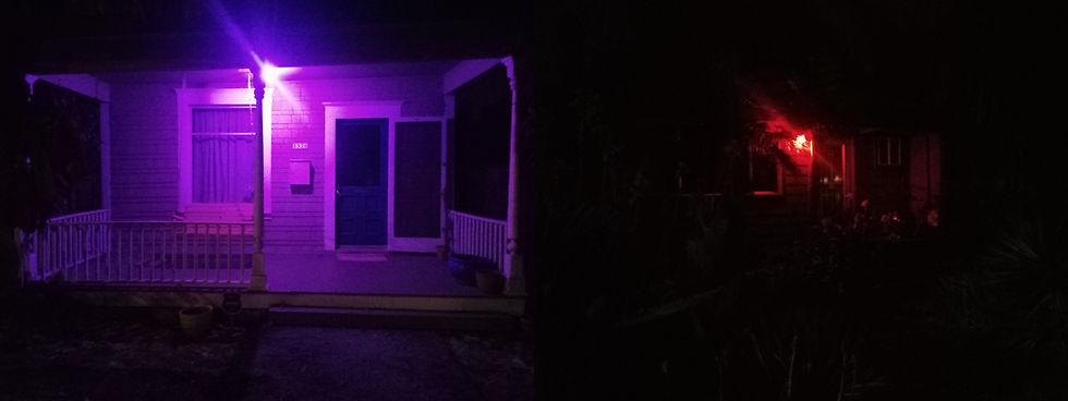
Here's another picture of another set of like-minded lights...

The light on the porch is red, but what I really like about the house is that the light on the inside is indigo. Indigo light is cool because it accentuates fluorescent colors better than some blacklights. So I imagine the people inside the house pictured above might enjoy blacklight posters and/or other fluorescent goodies. But the next pictures show houses with porches illuminated by just red...

Different kinds of colors can have different kinds of psychological effects, and red can make some people feel anxious, angry, or even hungry. So I don't know what the people in these houses were thinking when they decided to use it for their porch. But, since I took several more pictures of red lights on porches, I know that they weren't the only ones thinking it. I also know that some people prefer orange...
I don't see orange lights very often, and when I do, they're usually designed to mimic the firelight from candles or torches. The most common exceptions to that rule seem to be white lights encased in orange shades or globes, and the only opportunities I've had to photograph actual orange bulbs have resulted in pictures that look more yellow than anything else.
In any case, orange has been known to make some people horny, but there are still some other people who prefer yellow...

I've heard that yellow can make a person happy. So it's a wonder why I don't see more yellow lights at night. But I find plenty of green...

I like green. Some people say that it's supposed to help them feel calm, but I like it because it's in the exact middle of a seven-colored rainbow, and it too can have an accentuating effect on certain colors. It doesn't make all the fluorescent colors stand out, but it works just fine on fluorescent-pink, red, and orange, and I actually took advantage of that knowledge when coloring a recent illustration. But here's another special color, cyan...

I unfortunately don't have a cyan-colored light, and most psychologists seem to lump cyan in with indigo, calling them both blue. So I don't know how it affects people, but I do know that cyan is as different from indigo as yellow is from orange. Here are some true-indigo lights for comparison...

And here are some violet lights...

And were I to add an eighth color to the rainbow, it'd have to be pink. I've seen it next to red when looking at light dispersed through a prism, and there are enough pink lights around town to include it in one's color vocabulary...

Here's an interesting example of pink being used in conjunction with one of the two colors that people most often refer to as blue...
Again, because cyan and indigo are so different, I'm not sure whether there's such a thing as blue. If you saw cyan all by itself, you'd probably call it blue until you saw it next to indigo, in which case you'd probably call one color light blue and the other dark blue. But if one's light and the other's dark, then what does true-blue look like?
That's why it's helpful to give colors names...
Otherwise, we might run into the same problem with yellow and orange, i.e., nobody calls yellow light orange anymore than they call orange dark yellow. So here's another house illuminated by pink and what Russian-speaking people call голубой-colored light...

The house and lights seen above are very simple, but the picture is another of my favorites because of the play on symmetry and contrast, i.e., pink is often associated with the concept of femininity, and if blue exists, then it's often associated with the opposite concept of masculinity...

Yet, I don't know of any scheme that organizes pink and blue into opposites.
To clarify, here's an example of the organizational scheme by which most English-speaking people become familiar with color...

See? There's no pink in it. So, according to the standard color wheel chart for kids, blue isn't pink's opposite.
Here's another way of looking at color...

And here's another...

And another...

Within the electromagnetic spectrum, red and violet are opposites. Red is as close to pink as the chart directly above gets, but we definitely don't think of violet as being a masculine color, and I don't think the concepts of red and violet would be understood as boy or girl at a baby shower. However, there's a row of houses in North Portland (somewhere off Interstate) with a red light on one end and a violet light on the opposite...
There's also a place in Portland with a clear showcase of both the masculine and feminine ideals. But that place is almost entirely lit by green, which again, within the electromagnetic spectrum, is exactly in the middle...

But somewhere else in Portland, there's another house that makes use of red and what (on the electromagnetic spectrum) is best referred to as indigo...
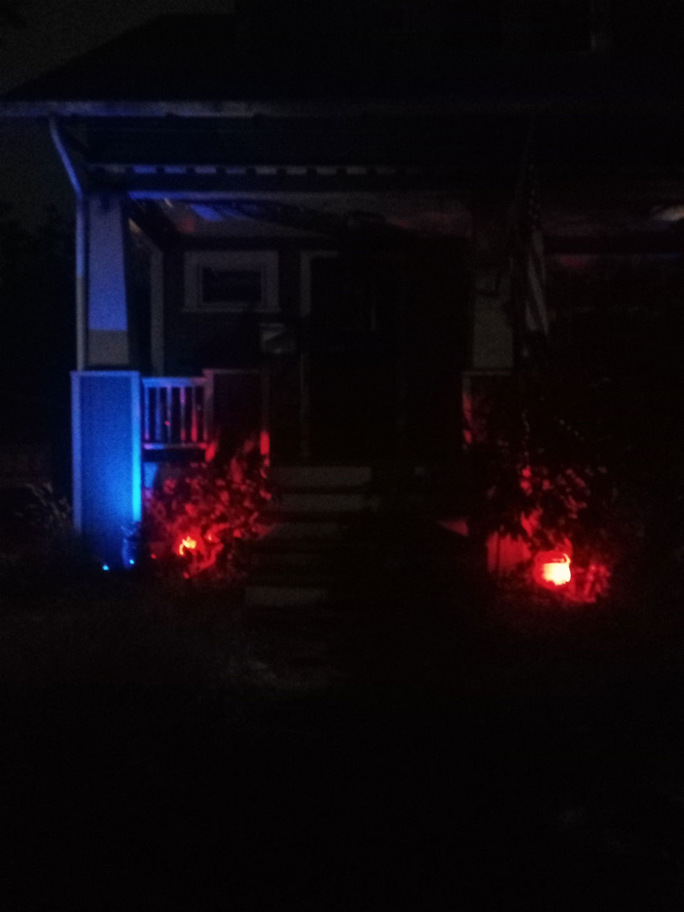
And there's actually something very interesting about that house that I tried to de-emphasize when I first photographed it. In fact, at the time, I was only conscious of it as being an additional color that I thought detracted from the "prettiness" of the red and indigo. So it wasn't until a few nights later, when I was riding around the St. Johns neighborhood, that I realized my mistake. Take a look at the house that helped me to understand...

Now take a closer look...

Closer...

From the street, all I saw were pretty lights. It wasn't until I saw the light-up flag in the window that I realized what the person in the house wanted me to see: red, white, and blue.
Believe it or not, the above picture wasn't taken at any time near the Fourth Of July. So I guess the person in the house is just huge a fan of America, who uses light and color to express his patriotism.
I'm an American, but I'm not a flag-waving American. So the colors on that flag aren't mine any more than the colors on this...

But I do love color. And, whether or not I agree with the many philosophies behind its various uses, I believe that what people try to say with color is important. So, out of respect for the person whose house I'd previously thought was best photographed with an emphasis on just red and indigo, I went back to look at it from a wider view...

And it's still pretty.

Comments